DULUX
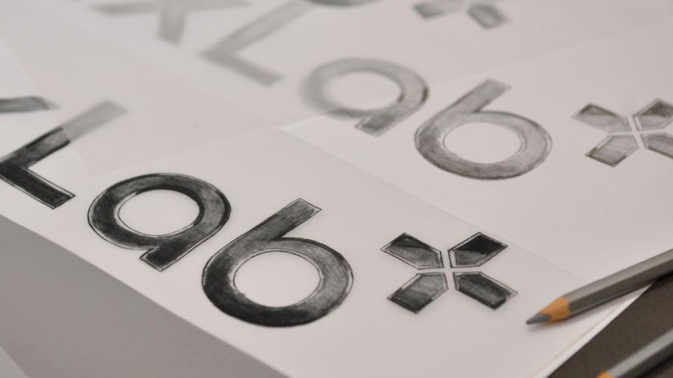
‘Elevate professional pride’
LET'S COLOUR
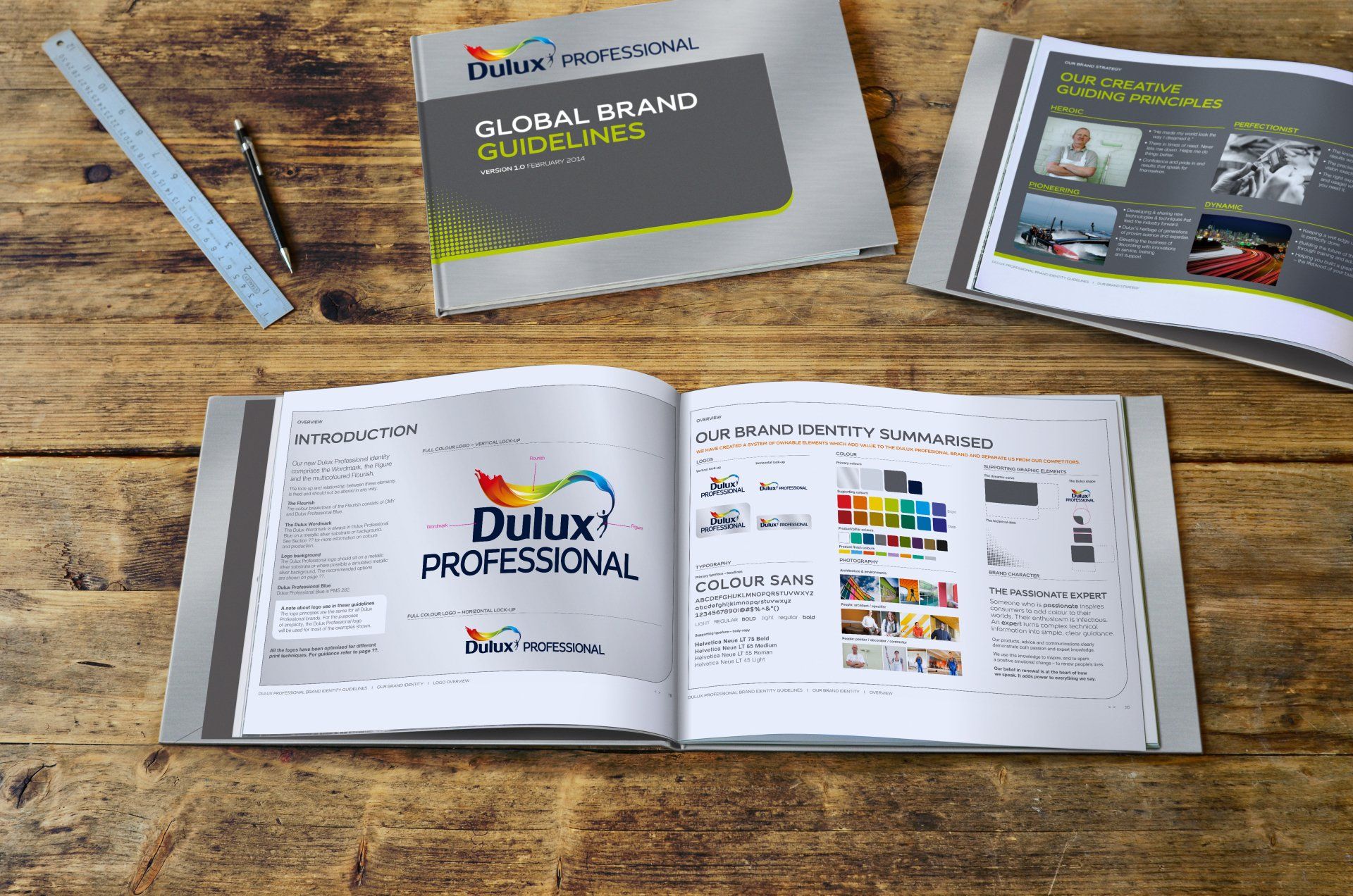
‘Elevate professional pride’ was the call to arms behind the new Dulux Professional Guidelines.
All areas of brand identity, signage, packaging and digital were collated and improved to raise standards and boost perception of this household name within the industry.
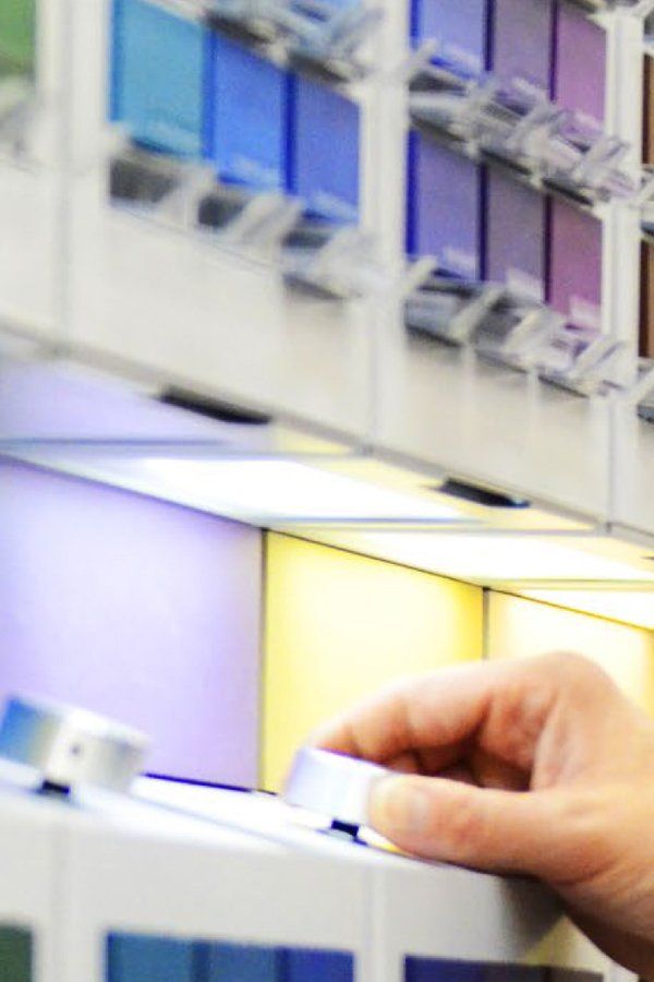
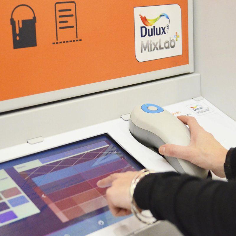
As well as selecting their perfect colour, customers can now also choose paint that solves problems: You need paint that will repel grease off kitchen walls, or, add 15% more light to a small room? An easy-to-navigate four-step process guides consumers through selecting a colour, choosing a paint function, selecting a finish type and watching it being mixed.
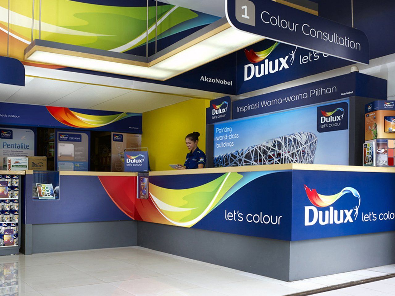
The brand’s global retail spaces had been neglected of late and were in need of transformation. After travelling the world to gather insight, we came up with a Utopian Store which clearly defines the brand’s principles and acts as a benchmark for every brand interaction helping to re-establish Dulux as a global leader.
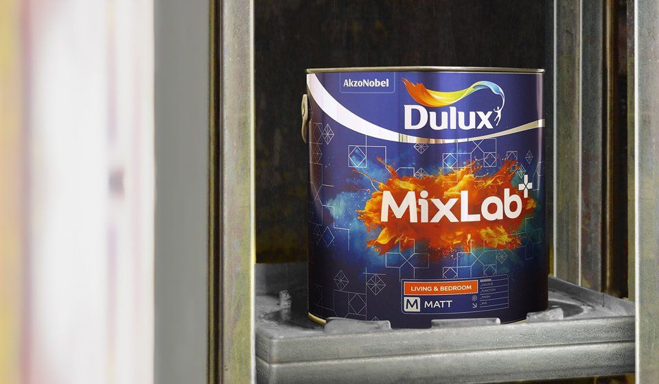
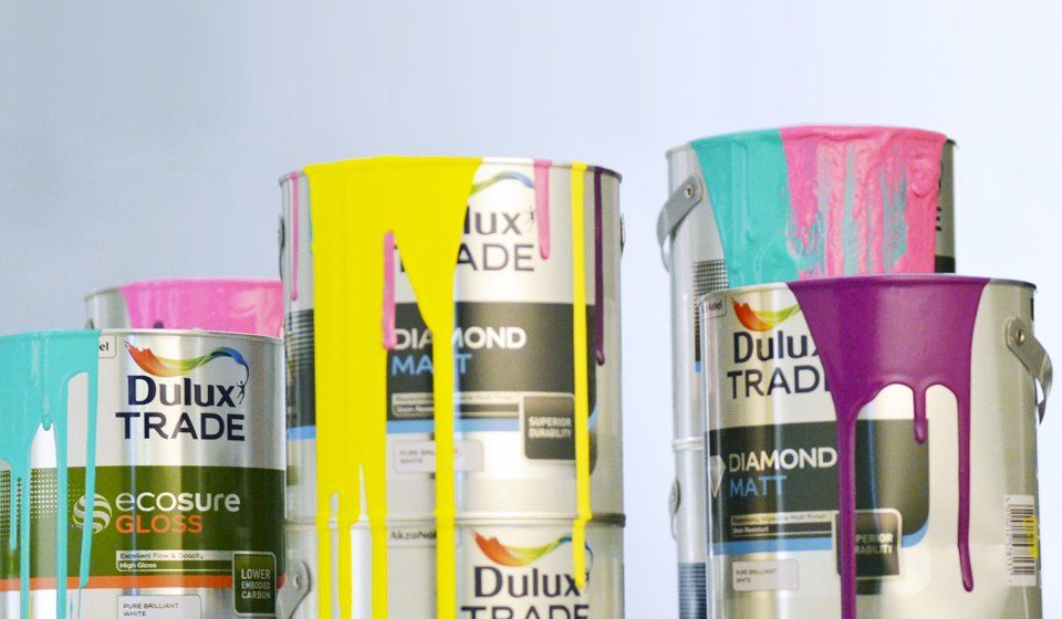
Dulux Trade is an industry leader with an eye on the future through its work investing in scientific research and improved formulations. We designed new packaging livery worthy of a category leader inspired by the guiding principles of: ‘Heroic, Pioneering, Dynamic, Perfectionist’.
Dulux Consumer sells a rainbow of inspo and we wanted to ensure the consumer knows that the quantity of colour is matched by the quality of finishes. For the re-design, the rich layers of a Vera Wang wedding dress were photographed to perfectly illustrate the style on offer to those wanting to dress their home in the best.